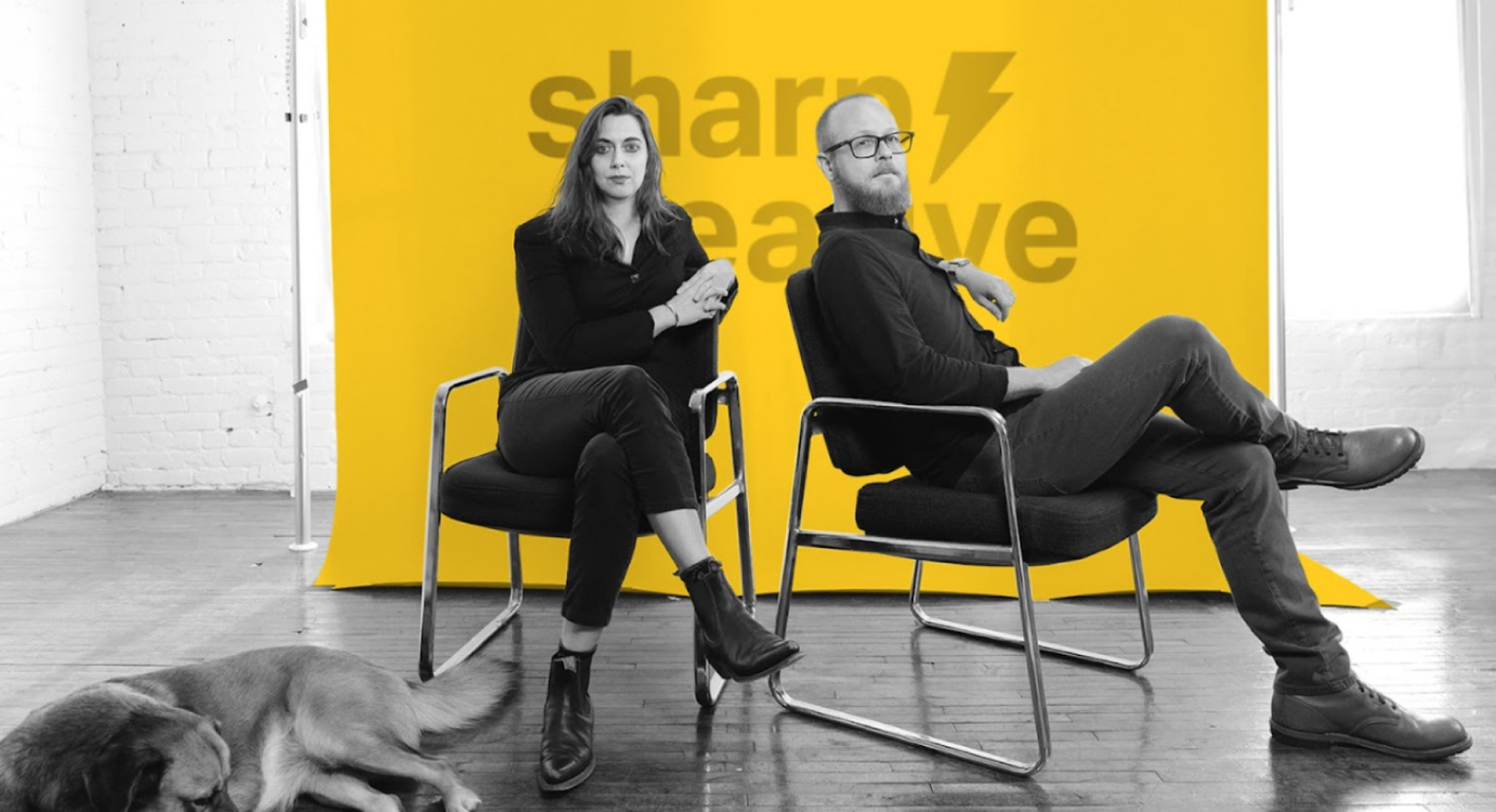
Rochelle Ratkaj Moser isn’t interested in design for design’s sake. As the Chief Creative Officer of Ratkaj Designs—a purpose-driven studio partnering with nonprofits and mission-led teams—she’s built her career around a simple conviction: design should be a tool for connection. In this interview, Rochelle shares her journey from agency designer to studio founder, her passion for accessibility, and why slowing down may be the most radical tactic of all.
Your Story: Every leader has a unique journey. Could you share a bit about your background, current role, and what moments shaped your career into what it is today?
I started my career as a graphic designer who was more interested in problem-solving than pixels. From early on, I felt drawn to the kind of design work that makes people feel seen, especially in spaces where communication is complex or high-stakes.
Now, I run Ratkaj Designs, a small-but-mighty creative studio that partners with nonprofits and purpose-driven teams. I lead our strategy and creative direction, but also stay pretty hands-on. We’re known for thoughtful branding, clear storytelling, and accessible design. I care a lot about making things that work well and feel good.
A few moments really shifted things for me. Leaving the agency world to work for myself was one—I didn’t just want to design, I wanted to shape how creative work gets done. Later, winning an Addy Award through AAF Madison felt like a turning point. It was a moment of recognition, sure, but it also cracked open this deeper belief in the value of what I was building. And then there’s parenthood—which has a way of recalibrating everything, including how I lead, how I listen, and how I spend my energy.
It hasn’t been a straight line, but the throughline has always been this: design is a tool for connection, and I want my work to reflect that.
Competitive Advantage: In a competitive field, what makes you and Ratkaj Designs stand out? What unique qualities or approaches have contributed to your success?
We’re not the loudest agency in the room—and that’s by design. What sets us apart is how deeply we listen. Before we ever touch a logo or a layout, we’re digging into the why, the audience, the lived realities behind the work.
Our clients—many of them nonprofits or mission-driven organizations—come to us not just for beautiful design but for strategic clarity. We help them translate complex, meaningful work into something people can instantly connect with.
We’re also pretty obsessive about accessibility. Not just in the compliance sense, but in how we think about voice, visuals, and user experience. Inclusive design isn’t a box we check—it’s a core value that shows up in every project.
And finally, we’re collaborators. We don’t come in with all the answers—we build relationships, ask thoughtful questions, and create space for co-creation. That trust shows in the final product. It’s why so much of our work is referral-based and why our clients stick around.
Success, for us, has come from staying small and sharp. We focus on doing excellent work for people we believe in. And that focus? It’s what keeps us grounded and growing.
Proudest Achievements: Is there a project you’re especially proud of? What made it stand out, and what impact did it have?
One project that really stayed with me was the Black Minds Matter report we created with EdTrust–West. It tackles the deep inequities Black students face in California’s education system—backed by data, but driven by lived experience. Our job was to design something that carried that truth forward without diluting its urgency.
We stripped the design down to the essentials—bold type, grounded color, photography that felt real and human. Every choice was made to elevate the message, not distract from it. And we worked closely with the EdTrust–West team throughout, creating space for reflection and feedback. That collaboration shaped the tone, the layout, the pacing—everything.
The report ended up reaching far beyond its launch. It was cited in advocacy work, picked up by education leaders, and shared across schools and communities. And to our surprise, it also received a Netty Award for Best Social Impact Graphic Design. Recognition is always nice—but honestly, the real reward was knowing the work helped fuel conversations that needed to happen.
That’s what we’re always aiming for: design that doesn’t just look good, but does good.
Effective Tools and Tactics: What strategies or tactics have been most effective for your business in achieving its goals?
Honestly, the most effective strategy for us has been slowing down. That might sound counterintuitive in an industry that’s all about fast turnarounds—but giving ourselves and our clients space to pause, ask better questions, and get clear on the “why” before jumping into deliverables has changed everything.
We’ve built a process around deep discovery—brand workshops, stakeholder interviews, audits—not just to gather input but to uncover patterns and pain points that clients often can’t see on their own. That clarity early on leads to better design decisions, stronger outcomes, and fewer surprises later.
Tool-wise, we’re big users of Adobe and Figma for creative collaboration, and we’ve leaned into Asana to better communicate. But it’s the way we communicate that makes the difference: transparent, thoughtful, and with just enough structure to keep things moving without feeling rigid.
At the end of the day, our best tactic has been building real relationships—with our clients and with each other. We get to do our best work when there’s trust, not just approval.
Future Vision: As 2025 approaches, what trends or challenges do you foresee for your industry? How is Ratkaj Designs planning accordingly?
There’s been a lot of noise about accessibility in design lately—but not nearly enough substance. Under the current administration, we’ve seen some progress in policy, but real enforcement and funding for accessibility remain painfully under-resourced. Accessibility isn’t just a checkbox for compliance or an ADA line item—it’s a civil rights issue. And yet, most creative industries still treat it like an afterthought.
The gap is especially stark in the digital space. New websites and campaigns roll out every day with flashy design and zero attention paid to screen reader compatibility, cognitive load, or language accessibility. The reality is: beautiful doesn’t mean usable—and inaccessibility is exclusion, plain and simple.
At our studio, we’re doubling down. We’ve been investing in accessibility not as a trend, but as a foundational practice—from how we structure content and color systems to how we guide clients through inclusive communications. We’re also having harder conversations when clients want speed over standards. It’s not always comfortable, but it’s necessary.
As AI tools and automation continue to flood the creative space, I’m deeply concerned about how accessibility gets overlooked in that rush. Most generative tools aren’t built with disabled users in mind, and design systems are only as inclusive as the humans behind them. We’re planning for that reality—bringing a human lens to every tool we adopt and making sure accessibility remains a creative and ethical imperative.
The future of design? It belongs to those who are willing to slow down, center people over products, and build things that work for everyone.