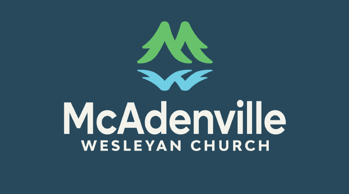
KB Creative has been recognized as an Honoree in Best Symbolic Logo at the Netty Awards for their work with McAdenville Wesleyan Church, and this recognition reflects something deeper than aesthetic execution. It reflects a growing respect for meaning-based design. KB Creative did not treat this as a typical church branding project, because they understood that symbols in faith spaces cannot be decorative. They must carry theological clarity and local identity at the same time. In this case, KB Creative found a way to merge scripture, place, and story into a single, minimalist mark. The trees forming the M are specific to McAdenville, a town known nationally for Christmas and traditions rooted in light. The mirrored W signals the Wesleyan identity in a way that is subtle but recognizable. The water at the base references the real landscape and the spiritual metaphor of living water. Being honored by the Nettys in this category is not just a nod to craft. It is a recognition that design is ministry, and that when symbolism is handled with precision and restraint, it can speak on behalf of a whole community before a single sentence is spoken.
Innovation and Differentiation
KB Creative approached this project differently than most church or faith-based logo work. Instead of starting with a pre-existing religious symbol, they started with the town itself. The design process began by asking what symbols McAdenville would see and immediately feel ownership of. That is how the Christmas tree concept emerged. This is not a holiday gimmick. McAdenville is Christmas Town USA. Families come from across the country to see those trees. They are a genuine part of the social fabric. KB Creative then layered the W reflection into the water so that the Wesleyan identity could be present without ever being loud or cliché. This allowed the mark to hold multiple meanings in a single glance. Most faith-based logos simplify to the point of losing nuance. This one simplifies in a way that reveals layers. It is both local and theological. It is specific without being exclusionary. It is symbolic without being cryptic. That is the innovation. KB Creative proved that subtlety can be high impact, and that reverence in design does not require predictability.
Measurable Impact and Success
Since implementation, this logo has not been treated like a graphic. It has been treated like a flag. Social posts using the symbol have driven stronger engagement and share rates because people saw themselves and their town in it. The congregation reports that having a symbol that is both spiritually grounded and locally grounded has helped articulate vision to neighbors and newcomers. Instead of leading with doctrine statements or paragraphs of explanation, members begin with a symbol that already communicates growth, heritage, and spiritual depth. KB Creative did not create a pretty image. They created a conversational entry point. The logo has unified print collateral, signage, apparel, and digital platforms. The identity system has also allowed the church to present itself alongside civic institutions with confidence and credibility. That is not common in faith-based branding. In an age where trust is scarce and audiences are quick to scroll, the real success of this symbol is that it earned pause, curiosity, and emotional recognition within seconds.
Creative Elements and Execution
KB Creative’s execution is a study in restraint. Instead of layering ornamentation to communicate meaning, they removed everything that was not essential. The trees form the M. The reflection forms the W. The base becomes water. The geometry is clean, modular, and intentionally built for flexible use. The mark works at very small scales, and it works in a single color. It can be embroidered, screen printed, etched, or used digitally without losing clarity. That is a key detail. Many logos look great in presentation decks and fall apart in the real world. This one survives actual use cases. KB Creative also built story into the construction. The trees reference tradition. The water references place and scripture. The single mirrored form references spiritual reflection and alignment. This is why the symbol feels both modern and timeless. It is design that is rooted, not trendy. It shows that creative excellence is not defined by complexity. Creative excellence is defined by the ability to say everything necessary with as little as possible.
Overall Excellence and Industry Advancement
KB Creative’s Honoree recognition is well earned because it signals to the broader design industry that faith-based identity can be thoughtful, original, and grounded in real context. Many churches assume that a cross is required for clarity. KB Creative proved that clarity can come from specificity and story instead. This project demonstrates how brand identity can act as a catalyst for growth. Since adopting the new identity system, the church has experienced a reported increase in attendance exceeding 200 percent. That is real-world evidence that a logo can be more than just a visual. It can be an activator. KB Creative advanced the category by showing that symbolic identity is not only relevant, it is essential when done with intention. This work sets a new bar in the church and nonprofit sectors by modeling how design can translate heritage, theology, and place into an emblem that functions like a shared language. For faith-based organizations seeking modern relevance without losing sacred grounding, this project is a blueprint.
About the Netty Awards
The Netty Awards are a prestigious awards program that honors top leaders and companies across various industries in the digital age. With over 100 unique categories and a longstanding track record as one of the most trusted organizations in the industry, the Netty Awards celebrate achievements in Design, Social Media, Influencers and Creators, Web, Advertising and PR, and Apps and Software. Recently featured in USA Today for their Top Agencies List, the Netty Awards are recognized as one of the most trusted agency directories for decision makers.